Kao Collins Inkjet Inks Reduce Risk of Ink Migration
Download
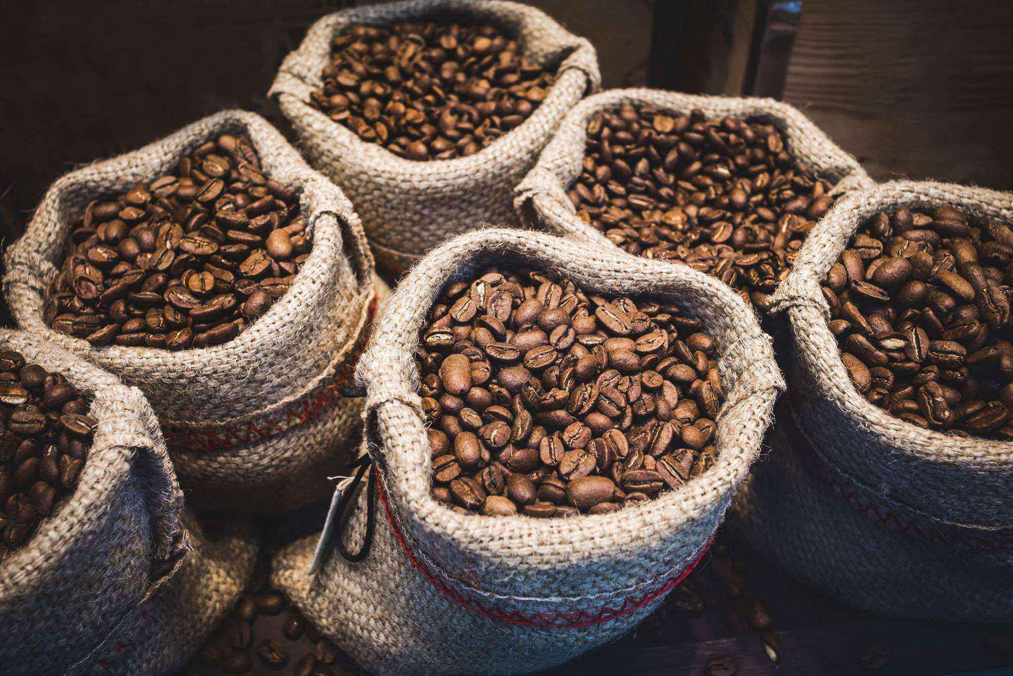
There’s nothing better than a great cup of coffee brewed with fresh, rich-smelling coffee beans. Much like craft beer, coffee-lovers are devoted to their gourmet brand. They seek quality beans from local or regional companies that offer unique flavor profiles with beans from single countries of origin.
While gourmet beans may be pricier, the cost savings from home brewing can easily offset the higher price. Also, many people find the joy and comfort of homebrewing to be a zen-like experience.
It’s a competitive landscape, not only among the big brands but also the craft roasters trying to set themselves apart from the crowd and quench the growing demand for great coffee.
INDEX: Jump to a Design
Of all beverages consumed the previous day, only bottled water, at 66%, beats coffee. Soft drinks came in at 36%, tea at 46%, according to a National Coffee Association report.
To take advantage of this high-demand market, coffee companies are doing everything they can to stand out by showcasing their roasted beans in creative flexible packaging.
Like wine and spirits companies, coffee roasters pride themselves on both having a catchy company name and creative packaging designs, which are as varied as the roasted coffee flavors themselves.
These designs are meant to do more than “look pretty.”
They tell a brand’s story and convey valuable product information through color, graphics, and words while trying to stand out from the crowd of competitors lining store shelves.
10 Flexible Packaging Design Examples
Take a look at these coffee-packaging examples that succeed for their simplicity, effectiveness, and exquisite design:
Mt. Comfort Coffee
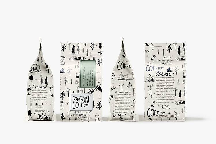
Classic, with a Dash of Whimsy
When it came to a brand refresh, Design Womb created sophisticated yet straightforward icons from nature for Mt. Comfort Coffee. It is artwork understated – classic, yet whimsical. The package tells the brand story while different colored labels convey the coffee details visually and in words. Can we get a print of this to hang in the kitchen?
Te Aro Coffee

Bold and Distinct
On the other end of the design spectrum, is the Te Aro brand, developed by Akendi. Modern and minimal describes the design. The rich brown color of the flexible packaging combined with the bold color labeling and contrasting brand name makes the product hard to miss and quick for the coffee lover to find their preferred flavor.
Coffee Beans
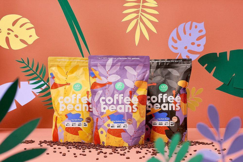
Ease into the Day
“Coffee Beans,” a product of EatNeat Foods in Tallinn, Estonia, turned to Hmmm Creative Studio to create the packaging for their brand launch. If the caffeine doesn’t wake you up, the fresh, clean colors and flat design will ease you into the day, warmly waking you.
Botanical Coffee
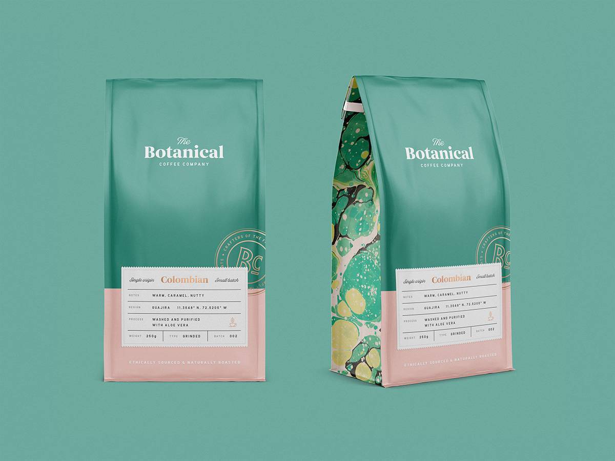
Something Special
The design team at Green Cameleon needed to convey a message about The Botanical Coffee brand, a high-end, gourmet product that incorporates natural products into the production. The retro colors on the front, combined with the look of expensive silk print clothing for the side panels, say you’re getting something special.
DropInCoffee
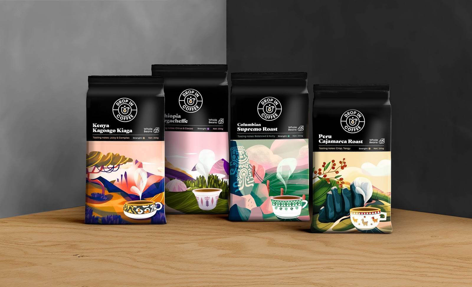
Unique Art for Each Country
Forma Station created the name of DropInCoffee and the unique signature art, including the cup style, that reflects the country of origin for each package’s beans. The soft designs and colors contrast with the black crown of the bag to stand out from other products on the shelf.
Ritual Coffee

No Mistaking this Brand
San Francisco-based Ritual Coffee looked to Good Stuff Partners, their long-term agency, for a brand refresh that included a more environmentally-friendly flexible package of compostable paper. The design is bold. There is no mistaking this brand on the shelf. The packaging includes a cardboard band with product information that offers front and back printing to help the consumer and tell the brand story. The design firm earned an Award of Excellence from Communication Arts, the most exclusive international design competition.
Kohana Coffee

From Spartan to Fresh and Stylized
Helms Workshop transformed the Kohana brand from its previous Spartan look – a revolutionary shift to position the brand for the goal of being a national brand. The fresh color of the clear-sky background combined with the stylized coffee buds and rich earthy chocolate says this is a top-quality product.
Halfwit Coffee Roasters

Mad Scientists at Work
Right up front, the name Halfwit Coffee Roasters is fun and memorable. The primary imagery is a throwback to the dawning of the atomic age and space-age because they claim their coffee is out of this world. The company relies on unique label colors to distinguish the different roasts. After the country of origin, the label presents the packaging date to emphasize the freshness.
Rose Park Coffee

Casual and Friendly
Nothing gets in the way of the brand name for Rose Park coffee. Ruthie Daugherty chose a watercolor look to the script that making it casual and friendly with a sophisticated flair. There’s no mistaking the packaging or the brand name. The branding showcases that sometimes simple is best.
PT’s Coffee

Where the Bison Roam
The midnight blue of the background establishes a classic feel for PT’s Roasting Company that combines smartly with the natural color of the friendly-looking bison logo. Carpenter Collective set out to celebrate the company’s 25th anniversary with a brand refresh. The bison, incidentally, was seen in a pasture not far from the Kansas-based company. The packaging needed to offer the flexibility to print labels onsite for the 70-plus roasts produced.
How Flexible Packaging Benefits Coffee Brands
See Inks for Food Packaging
Get Started
Consumers prefer flexible packaging for many reasons, including:
- Coffee in flexible packaging is easy to stand up.
- There is a growing awareness of the lower environmental impact compared to plastic containers or metal canisters.
- Flexible packaging is lighter, which reduces transportation costs, and requires fewer resources to produce.
- Flexible packaging keeps coffee fresh on the shelf as it does at home.
These and more benefits help explain the increasing usage of flexible packaging, according to Smithers Pira, an international authority on the packaging, paper, and print industry supply chains. They expect the market value of flexible packaging to hit $282.6 billion by 2022.
Printing on flexible food packaging requires inks designed to cure while not affecting the product quality. Producers may use a UV-, LED- or EB-curable ink. A new, water-based ink called LUNAJET from Kao Collins offers an eco-friendly alternative to light-curable inks.
Explore | Ink for printing packages like these
Digital Printing Supports Variety and Flexibility
Craft roasters know their dedicated customers want the freshest products. They also want variety. That means roasting smaller batches and many different levels of roasting and bean sources, which creates packaging production challenges.
Changing packaging information frequently can be costly for small-batch production. It’s not cost-effective to print and warehouse a high volume of flexible bags or labels.
Digital printing solutions deliver the needed flexibility of changing dates and other product information, whether on labels or directly on the packaging.
Kao Collins produces ink formulations for printing on flexible packaging and specializes in creating custom formulations, including color matching. Companies looking for eco-friendly ink to support their brand message can consider the water-based LUNAJET ink, a breakthrough technology using pigment nanotechnology.
Contact Kao Collins about how we support your product packaging strategy and operations.
 :